Outreach
Context
“We need to build a product to send campaigns.”
The prompt that I got.
SME Interviews
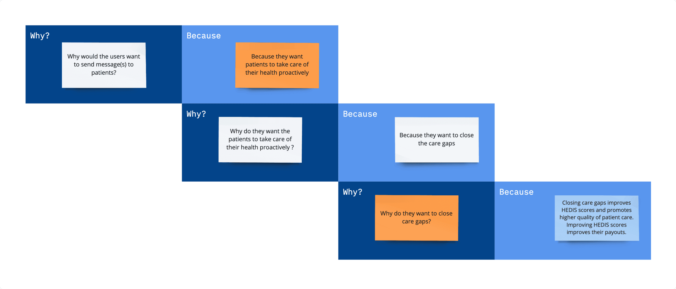
Why would someone want to reach out to a patient?
In order to figure out the answer to this question, I interviewed 3 subject matter experts who were employees of the company.
I asked questions such as -
Why do the care team send messages to a patient?
Who exactly is supposed to send these messages?
How do they do this currently?
When do they decide that they have to send a message?
What channels do they usually use for sending the message? (Channel - email, text message, voice message, letter, etc.)
Going to the root of the problem
🧐
Outcomes
Outreach can help users close care gaps and eventually earn profits.
Because of these insights, I designed the registry/dynamic cohort feature which are defined based on the care gaps.
Patients can fill assessments on their own if sent through an outreach.
This process can eventually save users’ time and hence they will be able to cater to more patients.
A lot of the times, patients do not pick up phone from unknown numbers which could be a crucial call from their care managers.
An outreach before the call can eliminate this situation.
Users currently maintain an excel sheet of patients to outreach to.
This practice is tedious with repetitive tasks and there is no way to track progress and outcomes. The product team also decided to pitch workflow automation to the customers.
Outreach manager is the persona we will be targeting.
Some customers have outreach managers for this sole purpose while at other customers, the care managers take the additional responsibility of doing outreach.
Competitive Analysis
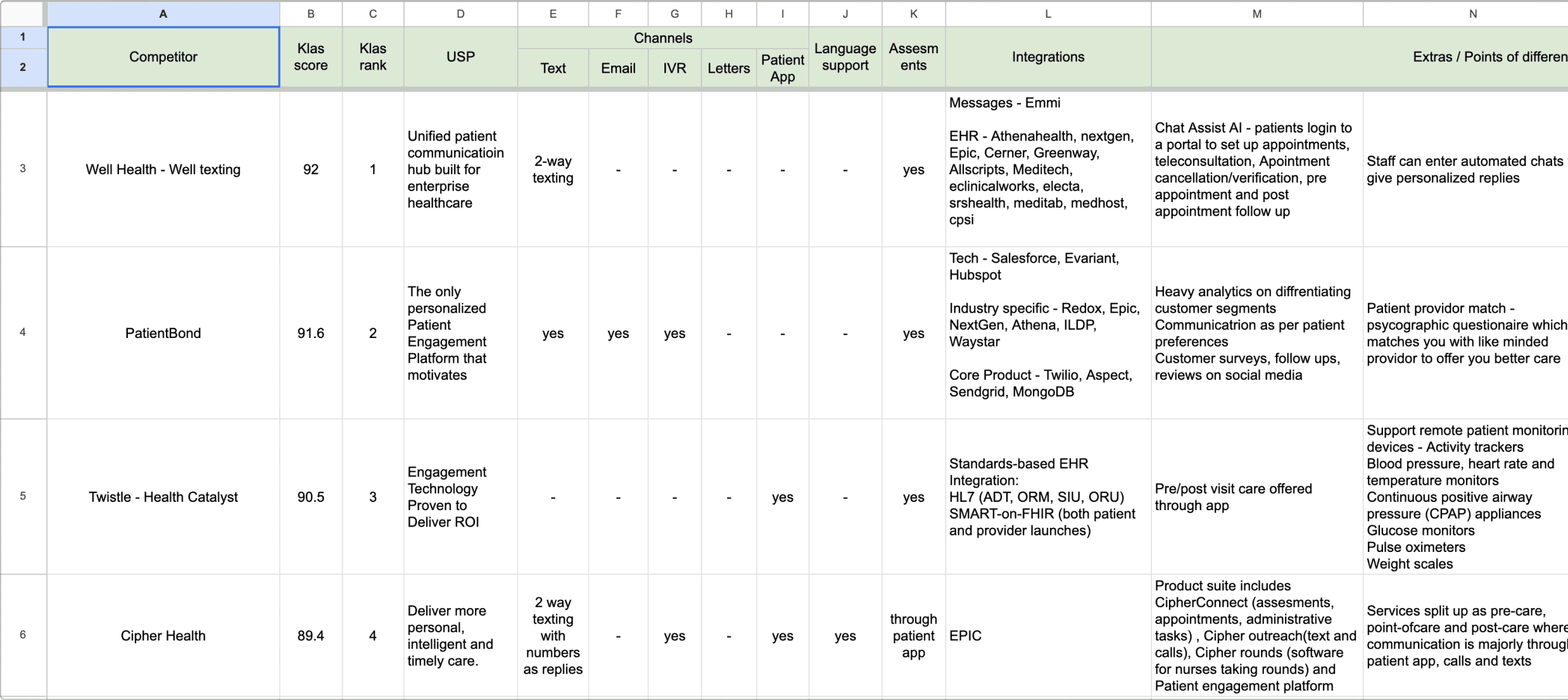
Exploring and analyzing what other players are doing in this space
Comparisons involved parameters such as -
Channels
Multiple language support
Assessments
Integrations with other systems
The entire team sat down to come up with HMWs
🤗
Outcomes
Given the demography that we serve, there is a need to support multiple languages specifically spanish and french as there are a lot of patients speaking these two languages.
We should be offering a patient app too where even the patient could directly reach out to their care team.(Remote patient care)
How might we
Reframe the insights into opportunity areas
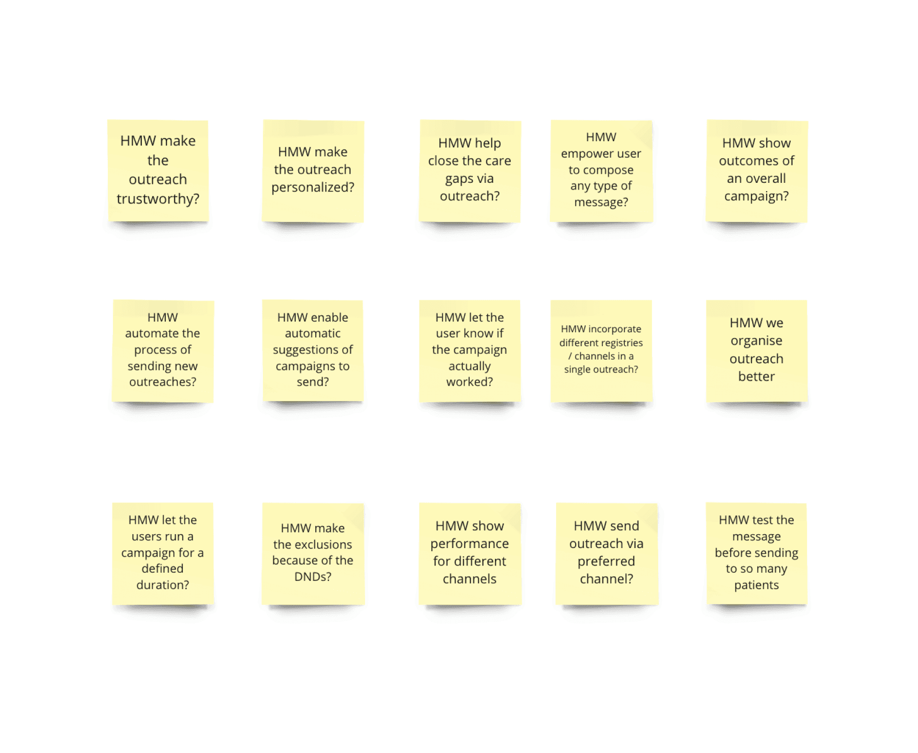
Based on the problems and insights that surfaced during the research, the team sat down for coming up with how might we statements to reframe our insights into opportunity areas.
This team exercise included me, product manager and the engineering manager.
Segmented the HMWs into the major themes.
Each person got to vote for 3 important areas.
Outcomes
How might we make an outreach trustworthy?
Sending outreach on behalf of patient’s primary care provider (pcp) adds a sense of trust. Decided to have the capability to add a pcp as the sender.
How might we make an outreach personalised?
A personalised message makes the outreach more trustworthy. Decided to have the capability to add personal information while composing a message.
How might we help close the care gaps via outreach?
Closing care gaps makes more money for the customers. Decided to emphasize on making cohorts on the basis of care gaps.
How might we automate the process of sending new outreaches?
Automating the process of sending messages can save a significant amount of time. Decided to introduce ‘Programs’ which is based on the IFTTT framework.
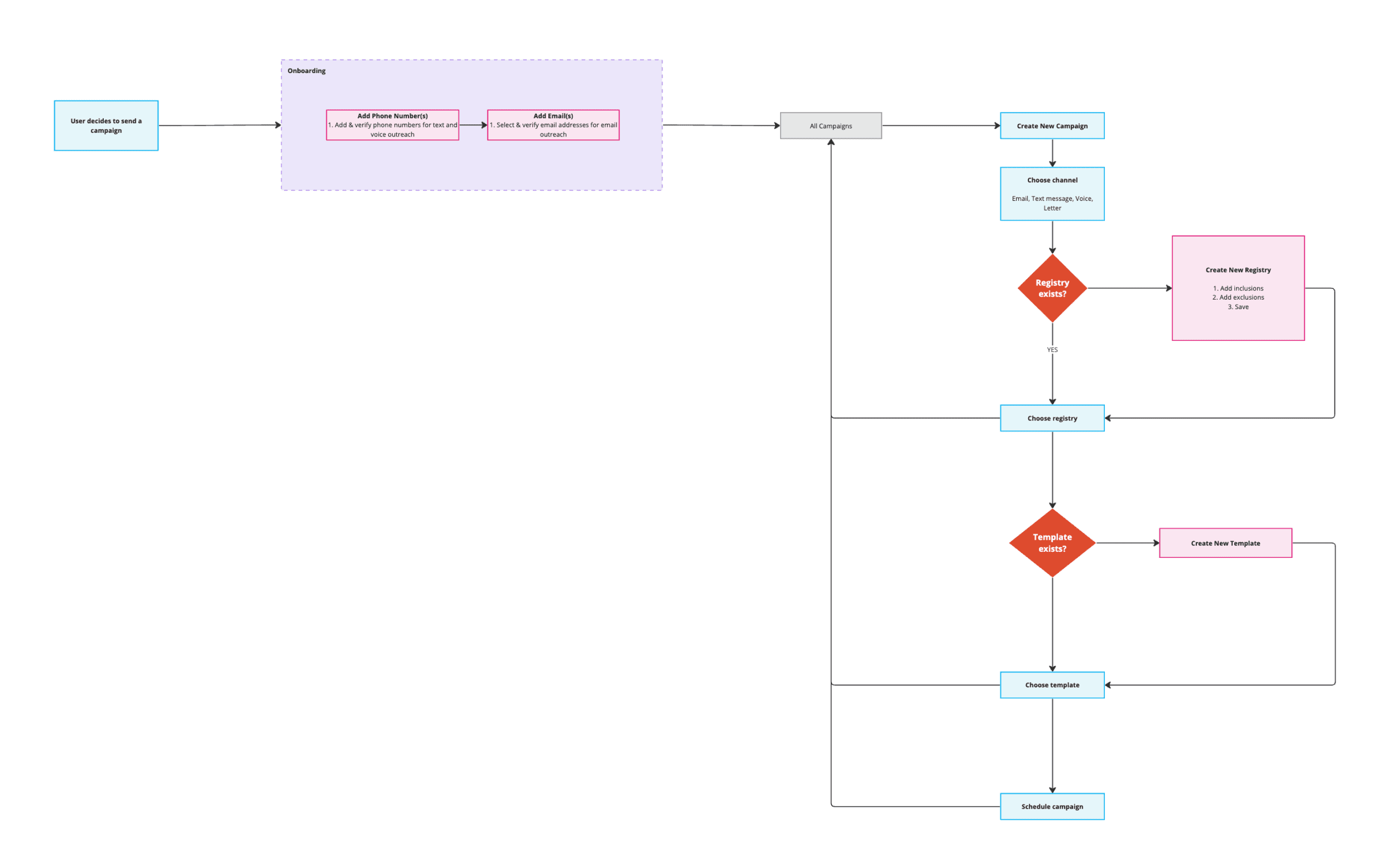
User flow
Identifying user flow opportunities
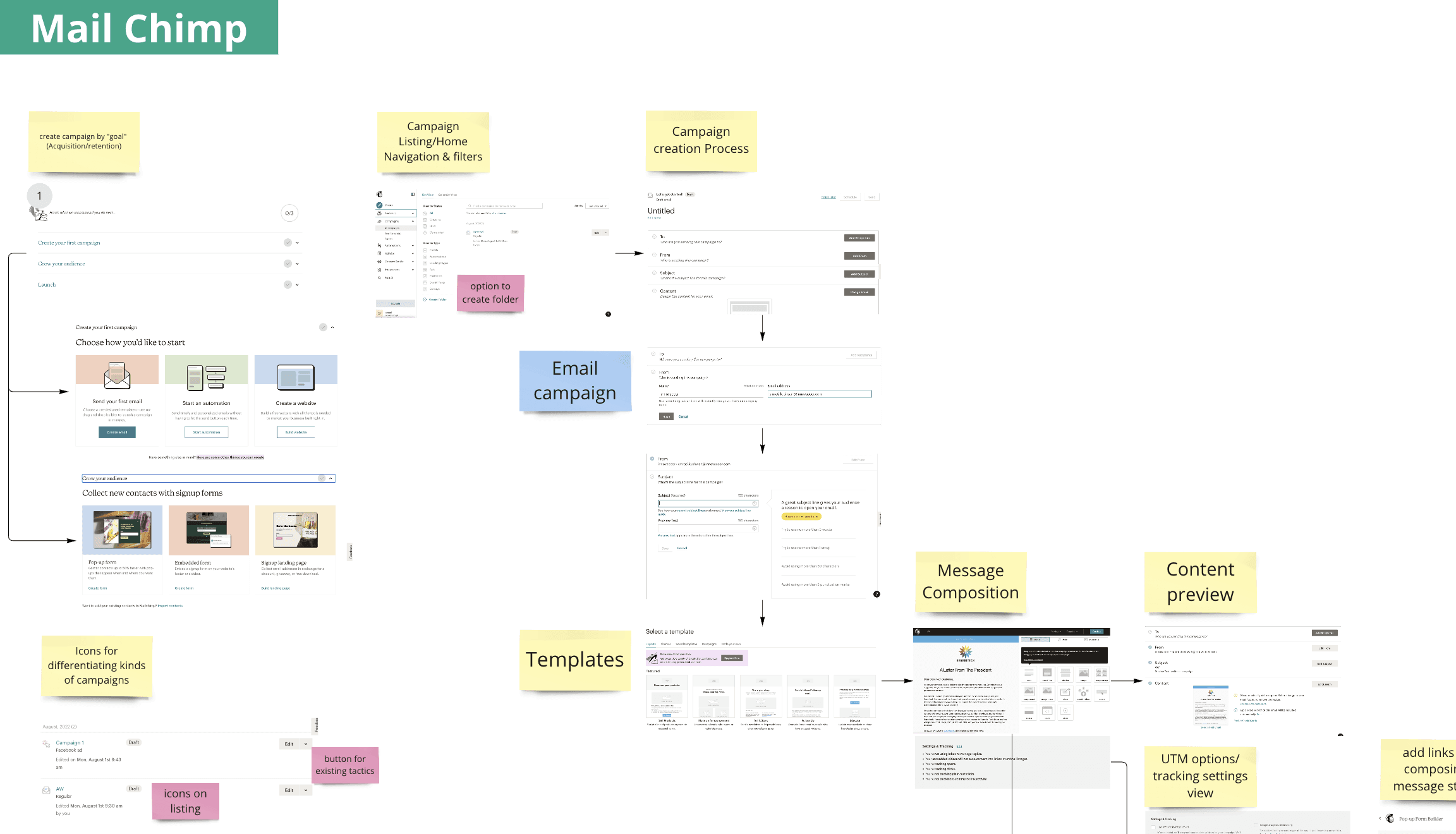
Audited 3 products in order to explore and assess the typical user flow for sending a campaign. These products were -
Mailchimp
HubSpot
LeadSquared
Some of the insights -
Content preview
Different channels
Templates
User flow
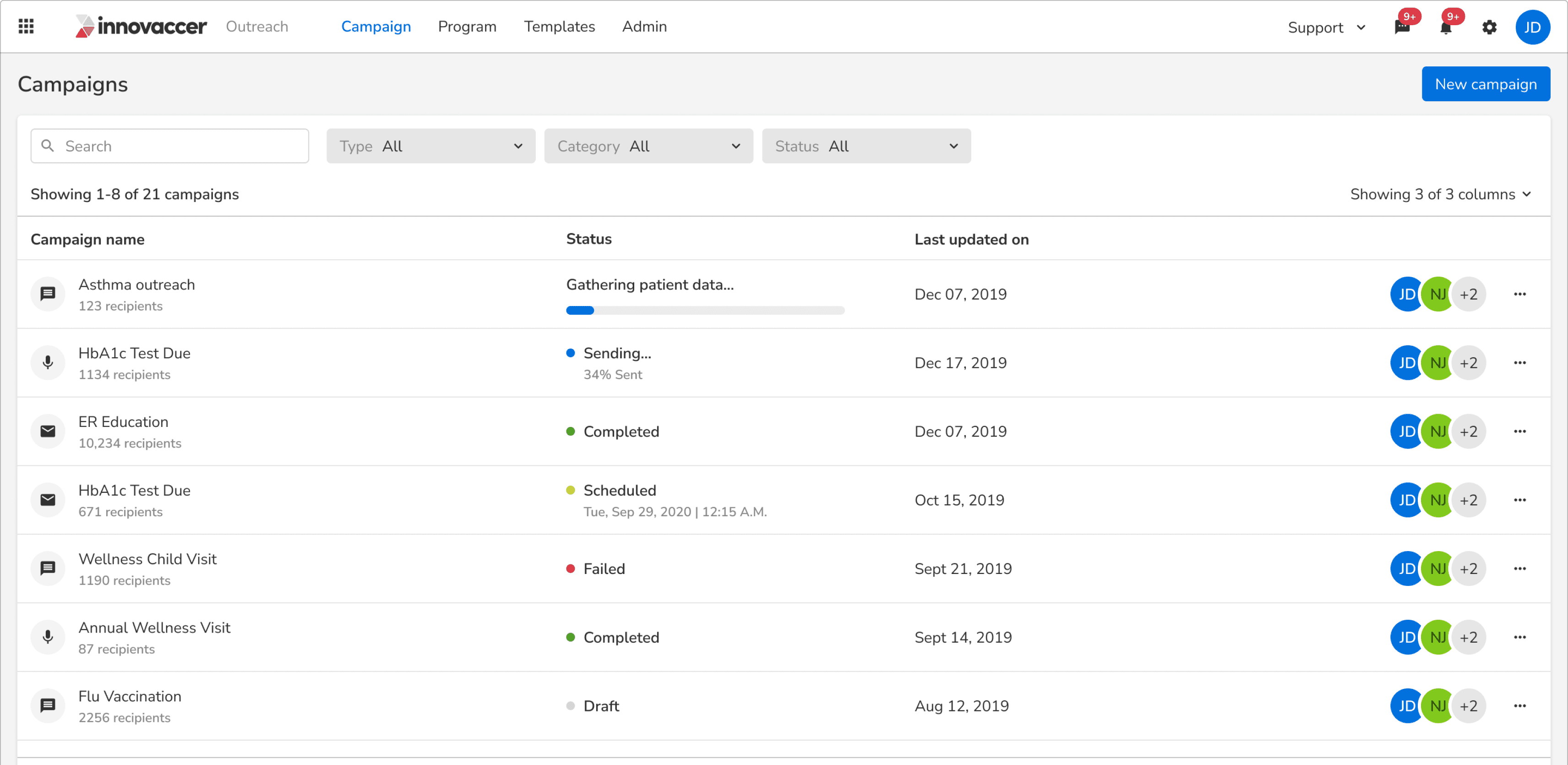
Prototype
Initial prototype
Usability testing
Sending campaigns based on the care gaps is highly useful.
Validated the decision of designing the registry/dynamic cohort feature which are defined based on the care gaps.
Workflow automation got a good traction because of it’s IFTTT abilities.
Validated the hypothesis that the users will save time because of automation.
Performance tracking needs to be a lot more mature.
There should be a well defined path where the patient’s visit can be highlighted as an outcome of the outreach sent to them.
Creating a dynamic cohort involved a lot of clicks and was a bit confusing.
Applying filters to create a dynamic cohort was a bit confusing for a few users.
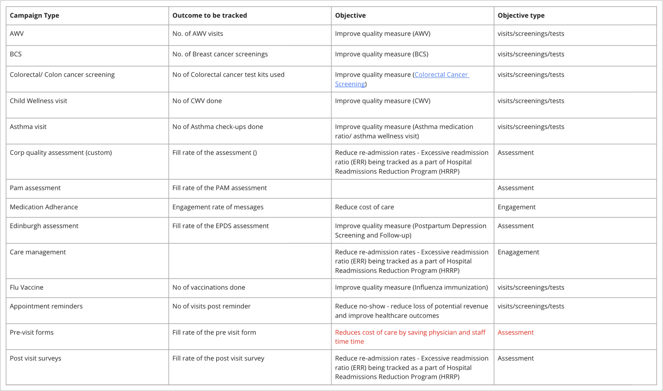
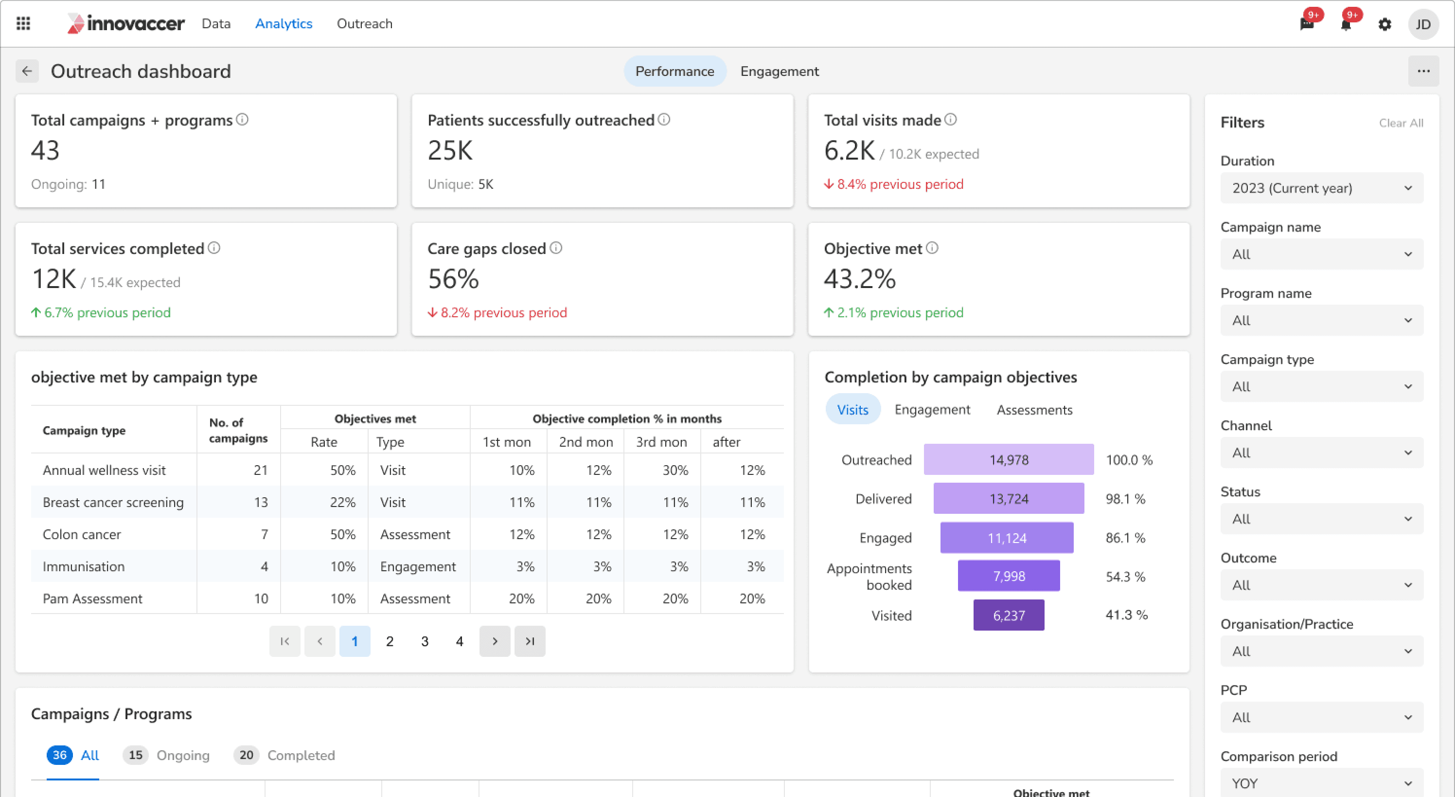
Success metric
Defining metrics that would give insights on how well a campaign has performed
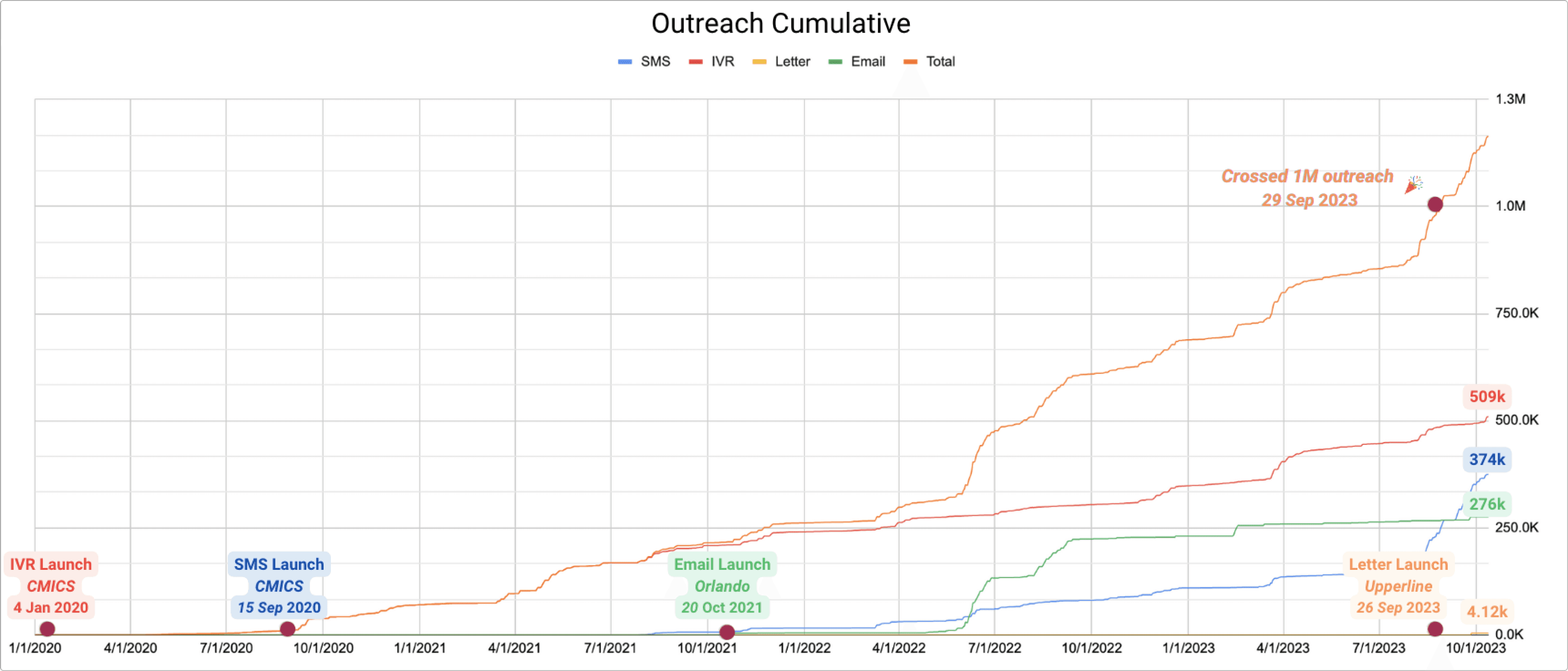
Impact
Total numbers of outreaches sent till Oct'23
Takeaways
How not to do user interviews and usability testing.
My interviews and tasks were not structured.
Handling conflicts.
Had a hard time convincing my product manager on why we should go with platform specific typefaces while designing for mobile.
Actually taking ownership.
This was the project where I started taking the ownership and accountability of the project completely.
Sometimes what is best for the users might not be the best for business.
We had to shut down working on the mobile app later on as no customer was willing to buy it.

